DASHBOARD -
Airbnb Data
Data Set: Press Here
Tableau File: Press Here
Overview:
This project focuses on using an Airbnb dataset for visualisation and informed decision-making. The dashboard presents key insights, helping potential hosts make decisions on pricing, availability, and understanding competition in the market.
Key Skills Used:
• Data Analysis: Using joins and aggregations to manipulate data
• Data Visualisation: Creating informative charts and maps to present findings
Dataset Description & Preparation:
The dataset includes 84,850 Airbnb listings with various attributes like price, location, and availability. Cleaning and transforming this data allows for effective visualisation and analysis.
- Join Data Tables: Merge listings and calendar data using listing_id.
- Create Visualisations: Generate graphs and maps to analyse pricing and availability.
- Build Dashboard: Compile all visualisations into a single, interactive dashboard.
• This project allows for a comprehensive analysis of the Airbnb market, providing insights into pricing strategies and optimal listing practices.
• It equips me with the skills to create interactive dashboards, enhancing my data storytelling capabilities.
• The findings can help both hosts and potential investors make informed decisions based on real data trends.
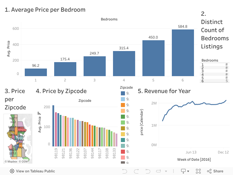
Visualisations:
1. Price vs. Number of Bedrooms: A bar graph comparing the average price per night with the number of bedrooms, helping hosts determine how much to charge based on their listing size.
2. Competition Analysis: A table count of listings by number of bedrooms, providing insights into market saturation for different listing types.
3. Price Heat Map: A geographical map showing average prices by zip code, allowing hosts to visualise price trends across different regions.
4. Average Price by Zip code: A bar graph displaying the average price for Airbnb listings per zip code, helping hosts understand the optimal pricing in their area.
5. Seasonal Trends: A time series line graph illustrating the best times of year to list based on booking trends, assisting hosts in maximising their occupancy rates.
Final Dashboard:
This Tableau project significantly enhanced my ability to create interactive dashboards that deliver clear and actionable insights. Working with the Airbnb dataset allowed me to sharpen my skills in data visualisation and understand how to best present complex data to decision-makers. I developed expertise in creating meaningful charts and maps that help illustrate key trends, such as pricing strategies and seasonal trends. This hands-on experience with Tableau has equipped me with the skills to design dashboards that tell a compelling data-driven story for business insights and market analysis.